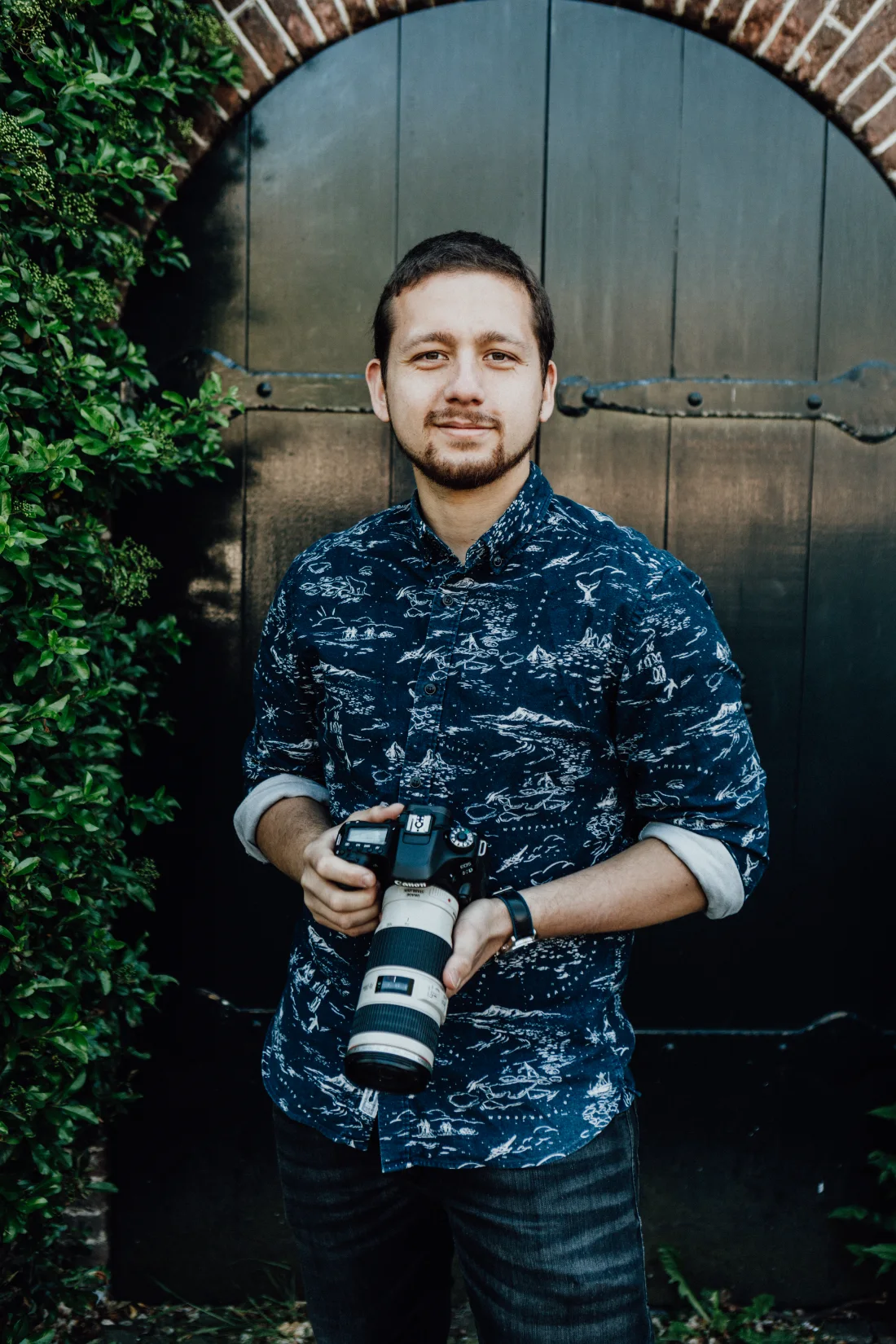
I design user journeys now. Mine started door to door, with a camera.
blckeye — a social-first agency for food and drink brands.
NO EXPERIENCE
My parents gave me a camera in high school. It went everywhere with me — the one thing I never left behind.
Fresh out of university, I wanted to live in Amsterdam. So I moved, and worked out how to make a living after the fact. With no experience and that camera, I started knocking on restaurant doors, offering photography to help them with their social media, branding and online presence.
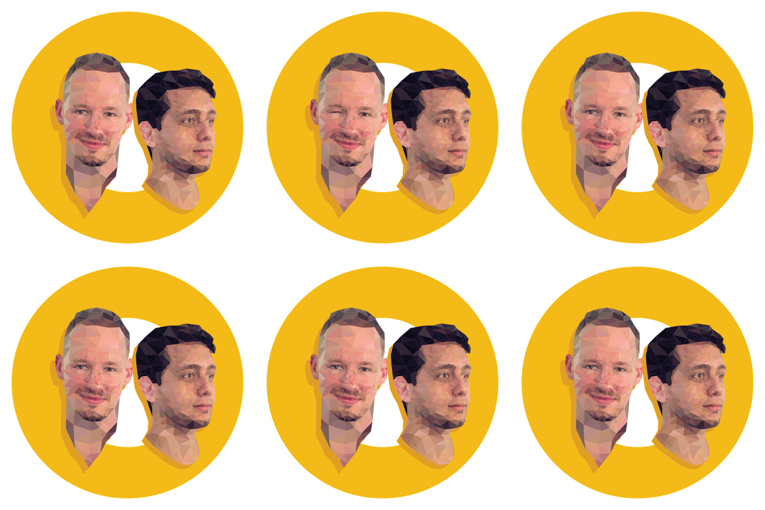
That turned into blckeye, the agency I co-founded with my business partner. From here on it was the two of us: we helped Dutch and German food and drink companies build their brands and expand — strategy through execution, everything made in-house. Brand books, packaging, posters, websites, and a monthly stream of photography.

FOOD & BEVERAGE
AMSTERDAM
The mission we failed at
Make the world’s best food and drink accessible to the consumer, by positioning our clients clearly and visibly in their market.
Two people cannot reach the world’s best food and drink. We failed at the scale of it — not at the method. Every brand we did reach got the same treatment: work out what it actually is, write it down so it survives us, then keep the promise in public. What we told clients: let’s talk the talk, and walk the walk.
The mark, and nothing else
Back when business cards were still a thing to hand out, this is what ours looked like. Is it important to show? No… but I thought I’d add it anyway. Charcoal stock, the mark alone on the front, the gold ring as its full stop.
Six worlds, one kitchen table
Restaurants, bottlers and vegan startups — each with its own climate, language and gravity. The job on every landing was the same: make the thing look as good as it tastes, then put it where people are already looking.
{{ c.name }}
Broadcast daily, from every world
Social first meant the phone was the primary format and everything else followed from it. We designed each feed as a whole rather than a stack of posts, then pushed the same look outdoors when a client needed the street.
Good food, fast — on the street
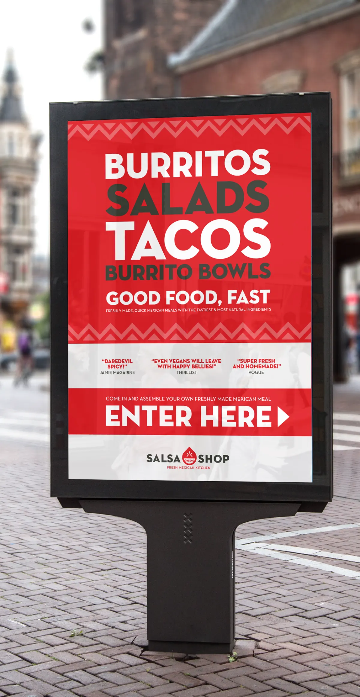
Posters and door-side boards doing the job of a menu, a review page and a sign at once: the range in four words, three press quotes, and an arrow pointing at the entrance. Same red, same zigzag, same voice as the feed.
Two outposts, open around the clock
A store you visit and a bakery you order from. Both built as one long scroll, both ending where the customer needs to act — directions in one case, an order in the other.
Brand books and posters
Every world got its charts before we left it — retainer clients got a brand book first, so the look would survive us. Posters came whenever there was an event or a doorway.
Inside a brand book
Every one followed the same ladder: what the customer feels, what the company actually is, the values underneath, then two sentences the whole brand has to keep. Casa Sabatelli’s filled-in version, below.
{{ q.text }}
Things you could hold
Label and pack design that had to survive a shelf, a phone screen and a courier box.
Looking back
Running blckeye taught me the part of design school leaves out: a brand is a promise someone has to keep on a Tuesday, with a delivery late and the fridge half empty. Client work at that size means doing the strategy, the shoot, the labels and the invoice in the same week.
It is also where I learned to design for a market rather than a moodboard — the shelf, the feed, the courier box, and the person choosing between two jars. That instinct is why my product work now starts with who is holding it.